Responsive Design
in Three Easy Steps
Responsive design uses variable, maximum, and minimum width specifications to make photos and text fit into whatever browser window size the user sets, whether on a desktop, laptop, tablet, or smartphone.
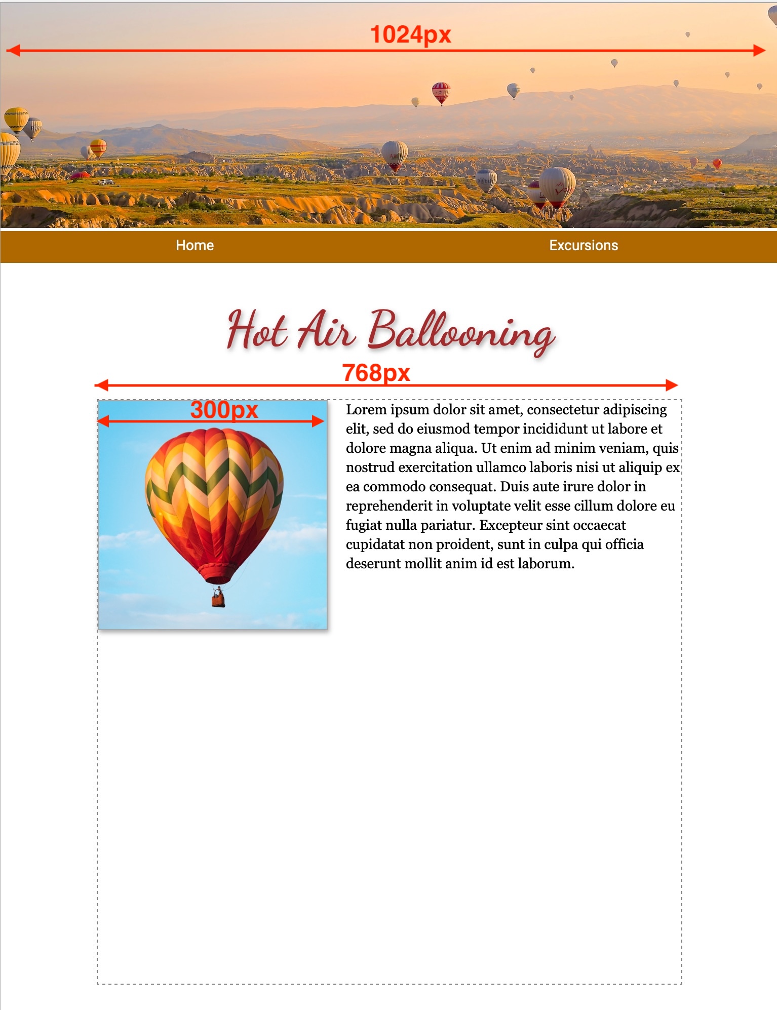 In this example of a fixed-width or “print replica” page, the page width has been set to 1024px so it approximates a sheet of letter-size paper on-screen. The page includes a banner image, also 1024px wide, a text box (div) of 768px, and a floated image of 300px.
Can I specify width in % or vw?
To retain the letter-size page appearance, these tag widths cannot be specfied in percent or vw (viewport widths).
Can I add “max-width”?
The supplemental style, “max-width: 100%;” can be added so that the page contracts to fit within smaller browser window sizes.
Can I add a media query?
For smartphones it would be nice to have the floated image full-width and to enlarge the text, and to increase the line leading of the text.
=
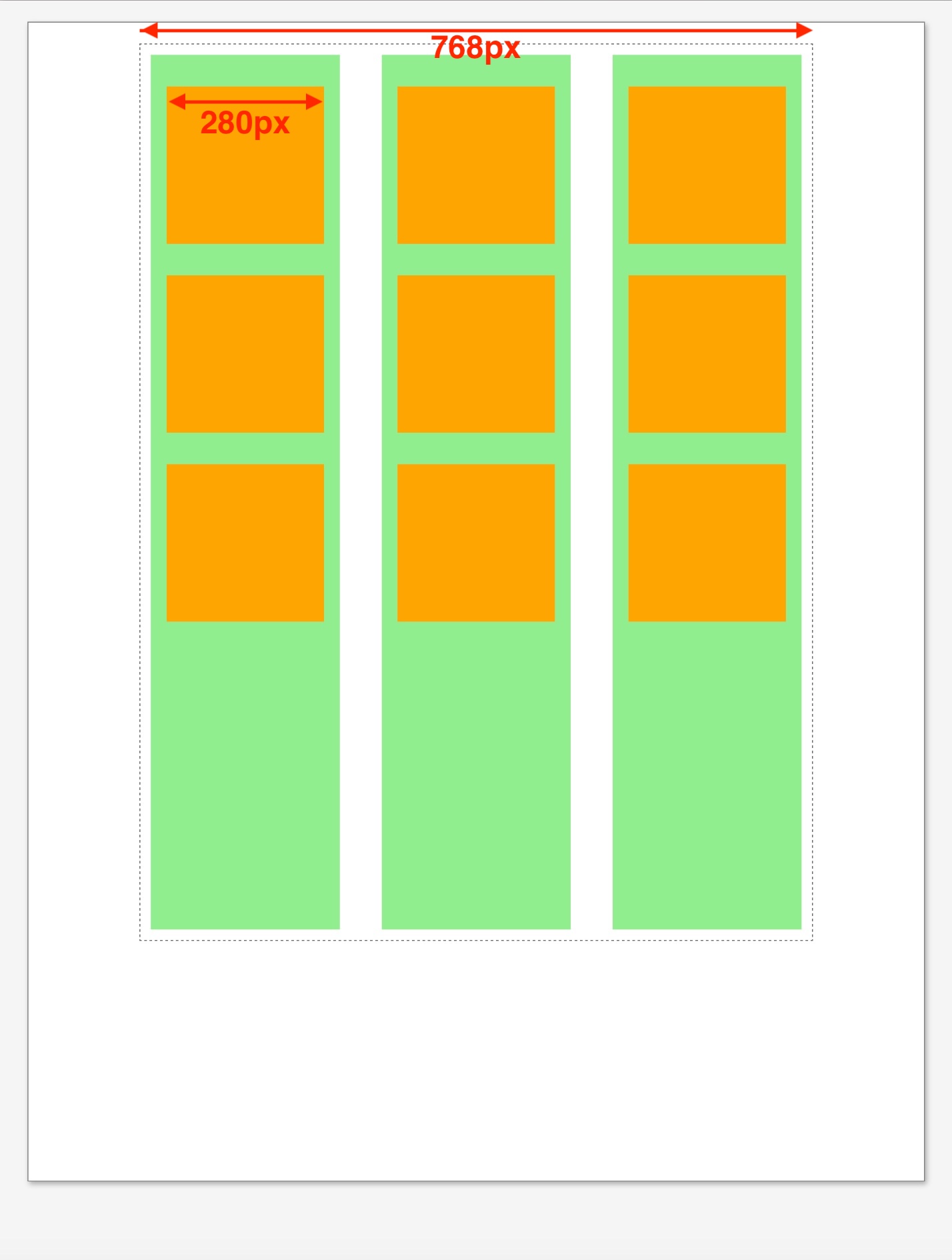
 This example shows a mockup of a catalog page that uses a 3-column grid layout (grid-template-columns: auto auto auto;), columns in green and future catalog items in orange.
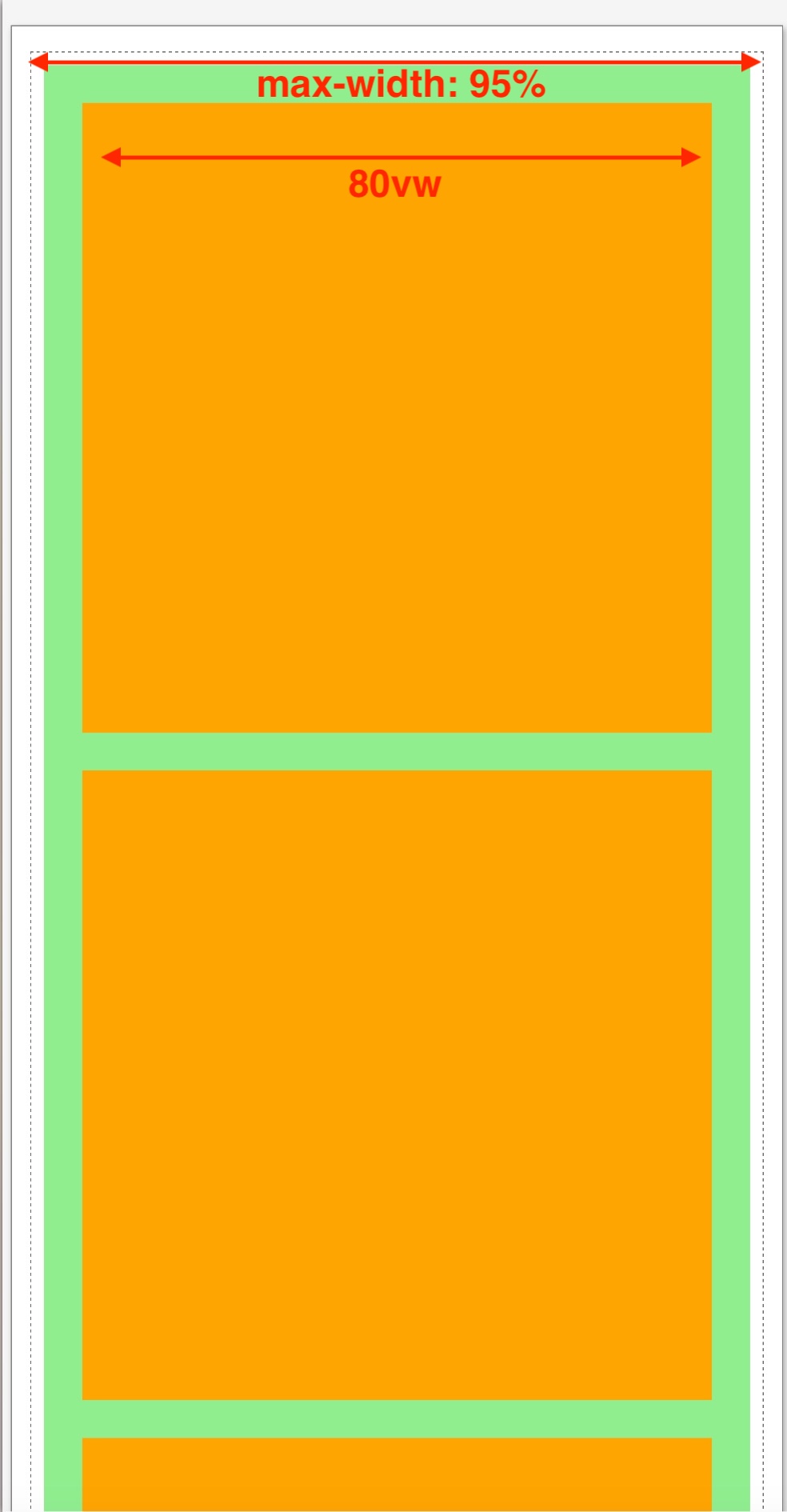
For the smartphone media query, the column number was changed to 1 (grid-template-columns: auto;) and the item width was set to 80vw (viewport widths).