What is Figma?
Figma is a web-based mockup tool for designing interactive app and web site screens. The interface is similar to Adobe Illustrator's drawing tools. You can make different screens (“Frames”) with shapes and text and navigate among them with buttons. You can share your mockup with a team or link to it on your portfolio site.
Making a Screen (Frame)
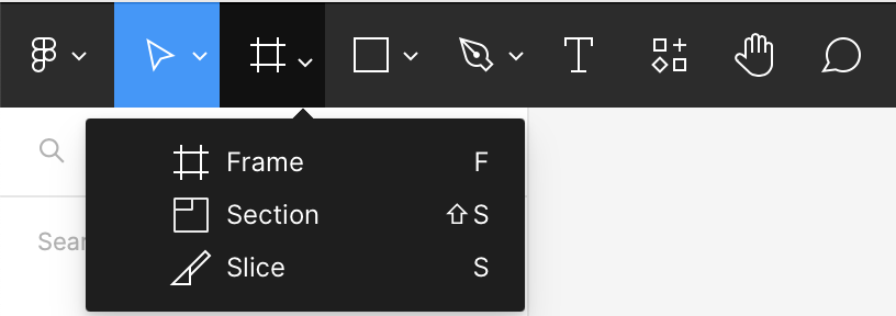
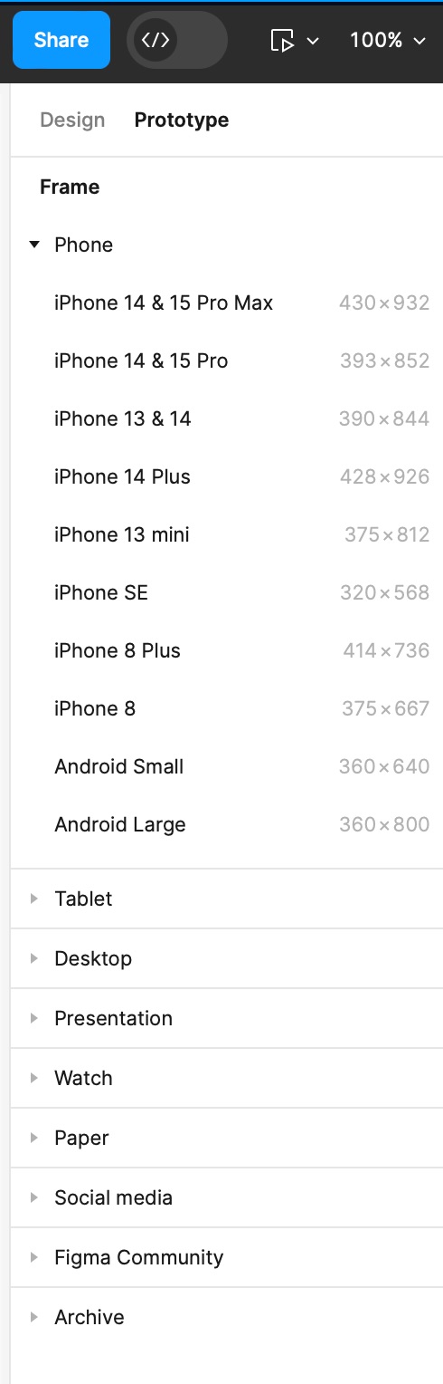
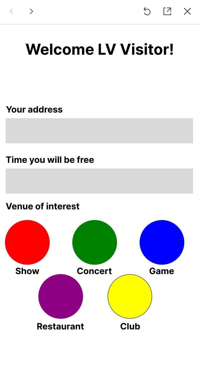
- Open Figma and use the Frame tool (#) to place a Frame in the window representing the device (e.g., smartphone, computer screen). Select the device from the palette at right. (Figure q)
- Use the shape tools to place fields on your app screen mockup, e.g., text, text fields, buttons.
Navigating Among Screens (Frames)
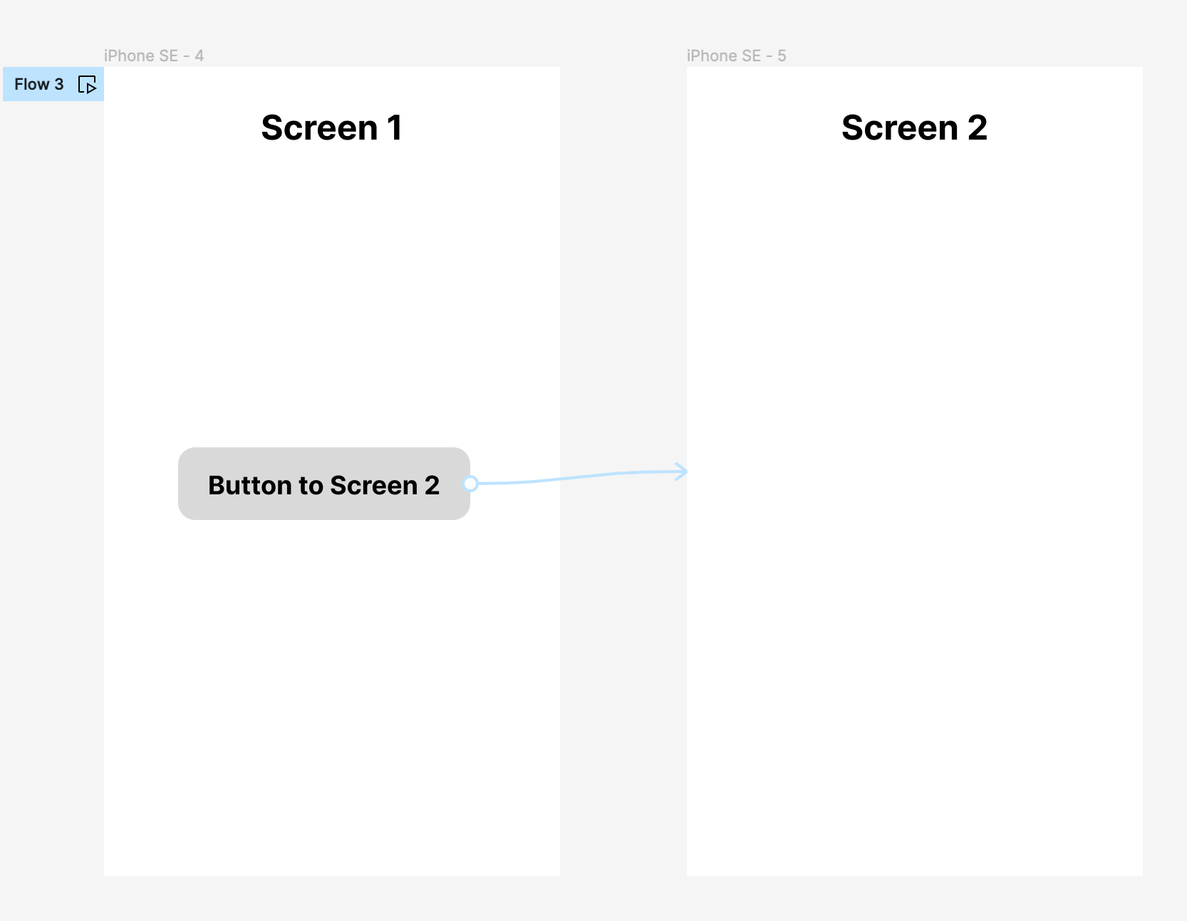
- Place a second screen in the window using the Frame tool. (Figure w)
- To navigate to the new screen (board), place a button (shape) on the first screen.
- In the upper right corner, switch from Design to Prototype mode. When you hover over an object, such as the “button” shape, “+” symbols will appear at the top, bottom and sides of the object. Drag an arrow from one of the + symbols to the second screen.
- Select the action that you want to trigger the change (e.g., On Tap, On Clicking, …).
- When the button is clicked, the mockup will then change screens in the Preview mode.
Making a Button with Hover and Active Effects
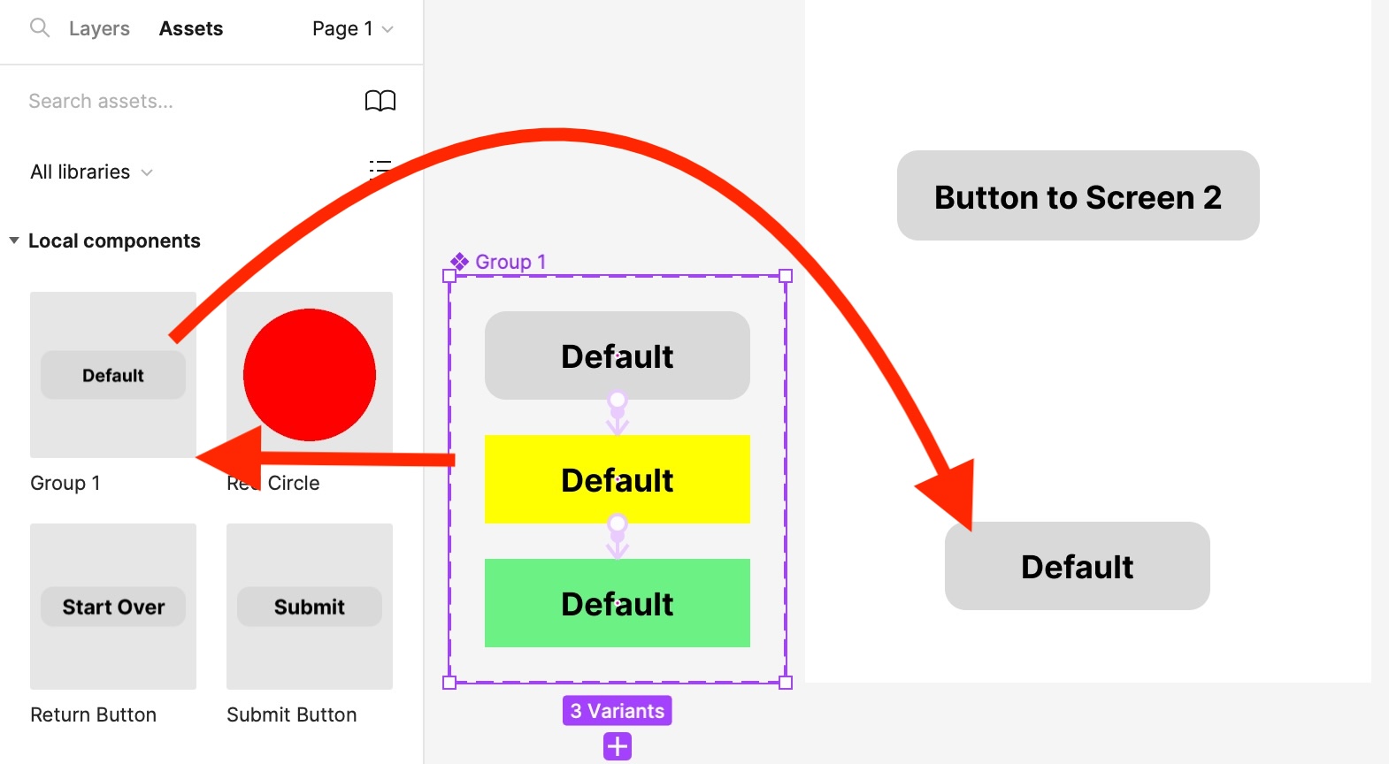
Interactive buttons must be designed off to the side as “Components” with “Variants” representing the Hover and Active states. When placed on a Frame, the variants will be hidden until Preview mode when they are hovered over or clicked. To use the Component in your layout, drag-and-drop from the Assets menu.
- To make a button with Hover (mouseover) and Active (click) effects, first draw the default state of the button off to the side.
- Convert the shape to a Component using the diamond-shaped Component tool at the top of the frame.
- Select the Component and click the “+” or Add Variant tool to duplicate the button. Design the Hover state as you like, e.g., with a different colored background, drop shadow, etc.
- Click Add Variant again and design the Active (click) state as you like.
- Change from Design to Prototype mode, hover over the first button, click on the “+” circle, and drag a line to the second Variant. Select the trigger as “When Hovering.”
- Repeat for the third Variant, selecting the trigger “When Clicking.”
- Components will appear in the Assets palette at left under the Local components tab. To use a Component in your mockup, drag-and-drop it from the Assets palette onto one of your Frames (you cannot drag from the main window or the buttons will not work). (Figure e)
Sharing Your Mockup
To share your mockup, click the Share button at upper right and select the Link button. You can then include the link in your portfolio, perhaps connected to a thumbnail of the design. (Figure r)
Reference
YouTube video on making buttons